
PWA Header & Footer Navigation Toolbars with SideNav using Angular & Angular Material
In this blog, we will create from scratch a navigation scheme suitable for a progressive web app that includes a fixed footer and header as well as a slide-out side-nav.
Angular/Material Version: 9
You can find the complete code on my GitHub at https://github.com/DaveStaudenmaier/AngularPWANavigationShell.
We are going to use Angular Material SideNav to create our navigation container that will hold a header toolbar, a footer toolbar and a sidenav menu.
Also, you can find a great overview of navigation on the Material Design website.
Let’s get started by creating a new Angular project using the Angular CLI. On your command line create a new project like this:
ng new pwa-nav
Angular will ask you if you want to add routing to your project. Type y. Then select the default stylesheet.
? Would you like to add Angular routing? (y/N)
We are using Angular Material so we will need a few things installed. Go to the pwa-nav directory and run this:
npm install @angular/material @angular/cdk @angular/animations
Now add Material to the project like this:
ng add @angular/material
Finally, we’re going to need Angular Flex Layout. Add it like this:
npm install @angular/flex-layout
A couple more set-ups and we’ll be ready to go. in pwa-nav, add a folder called features and another new folder called navigation
In the features folder, add the following four new components like this:
ng generate component homeng generate component forumsng generate component messagesng generate component about
And in the navigation folder add three components like this:
ng generate component header-mobileng generate component footer-mobileng generate component sidenav
Great! We’re ready to start adding code. Go ahead and edit the project.
In app.component.html, replace the default html with this:
<mat-sidenav-container fullscreen>

  <mat-sidenav #sidenav role="navigation" mode="push">
    <app-sidenav (sideNavClosed)="sidenav.close()"></app-sidenav>
  </mat-sidenav>

  <mat-sidenav-content fxLayout="column">

    <div class="header">
      <app-header-mobile fxHide fxShow.lt-sm>
      </app-header-mobile>
    </div>

    <main class="container mat-app-background">
      <router-outlet></router-outlet>
    </main>

    <app-footer-mobile (sidenavToggle)="sidenav.toggle()"  fxHide fxShow.lt-sm>
    </app-footer-mobile>

  </mat-sidenav-content>

</mat-sidenav-container>
<mat-sidenav> is an angular directive that is used to create a side navigation bar and main content panel with material design styling and animation capabilities. <mat-sidenav-container> is the main container, <mat-sidenav> is the side panel and <mat-sidenav-content> is the content panel.
<app-sidenav> is the selector for the sidenav component we created in the navigation folder. <app-header-mobile> is the selector for the header-mobile component we created and <footer-mobile> is the selector for the footer component we created.
fxHide fxShow.lt-sm tells Angular Flex Layout to only show the header and footer components if using on a small device like a phone. You can add additional toolbars for a different view for the desktop.
On the sidenav component, (sideNavClosed)="sidenav.close()" emits an event that tells app.component to close the sidenav.
On the footer component, (sidenavToggle)="sidenav.toggle()" emits an event that tells app.component to toggle the sidenav open or close.
mat-app-background on main gives us the Material background color default as the background color of the feature components.
Now add the associated CSS in app.component.css:
mat-sidenav-container, mat-sidenav-content, mat-sidenav {
  height: 100vh; // Component content fills entire verticle space
}

mat-sidenav {
  width: 40vw; // Width sidenav takes up when open
}

.header {
  margin-bottom: 8px; // Leave space at bottom of toolbar so elevation shadow effect will show
}

// Component content area
.container {
  height: 100vh; // Component content fills entire verticle space
  overflow: auto; // Keeps header from scrolling away
  padding: 10px; // Component conent padding around edges
  margin-bottom: 50px; // Matches height of footer so can see all content when scrolling to bottom
}
The height: 100vh property on the sidenav directives and our feature container is very important as it assures these will extend to fill the available space, regardless of the content size.
Now let’s add our toolbars. In header-mobile.component.html, replace the html that is there with the html below. class="mat-elevation-z4" will give us a shadow under the toolbar so it looks elevated.
<mat-toolbar class="mat-elevation-z4" color="primary">

</mat-toolbar>
In footer-mobile.component.html, replace the html that is there with this:
<footer class="footer">
  <mat-toolbar class="footer" color="primary">

  </mat-toolbar>
</footer>
And in footer-mobile.component.css, add the CSS shown below. This is what makes the footer toolbar stick to the bottom!
footer {
  position: fixed;
  bottom: 0px;
  overflow: hide;
  width: 100%;
  height: 50px;
}
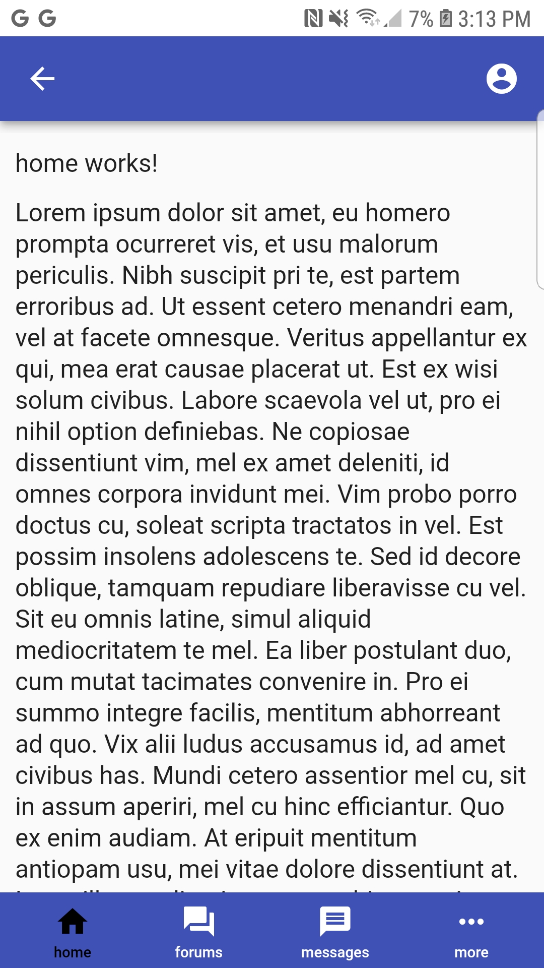
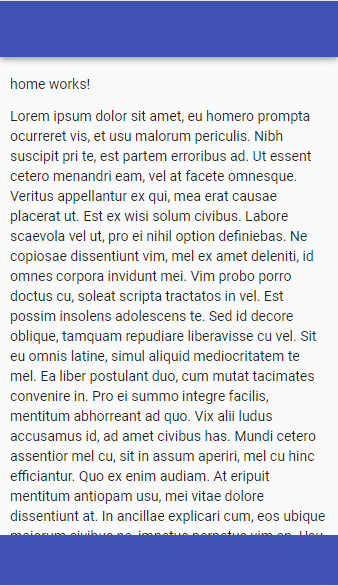
And then we’ll add some text to in home.component.html so we can make sure scrolling is working like this:
<p>home works!</p>
<p>
Lorem ipsum dolor sit amet, eu homero prompta ocurreret vis, et usu malorum periculis. Nibh suscipit pri te, est partem erroribus ad. Ut essent cetero menandri eam, vel at facete omnesque. Veritus appellantur ex qui, mea erat causae placerat ut. Est ex wisi solum civibus.
Labore scaevola vel ut, pro ei nihil option definiebas. Ne copiosae dissentiunt vim, mel ex amet deleniti, id omnes corpora invidunt mei. Vim probo porro doctus cu, soleat scripta tractatos in vel. Est possim insolens adolescens te. Sed id decore oblique, tamquam repudiare liberavisse cu vel.
Sit eu omnis latine, simul aliquid mediocritatem te mel. Ea liber postulant duo, cum mutat tacimates convenire in. Pro ei summo integre facilis, mentitum abhorreant ad quo. Vix alii ludus accusamus id, ad amet civibus has. Mundi cetero assentior mel cu, sit in assum aperiri, mel cu hinc efficiantur. Quo ex enim audiam.
At eripuit mentitum antiopam usu, mei vitae dolore dissentiunt at. In ancillae explicari cum, eos ubique maiorum civibus ne, impetus perpetua vim an. Usu putent audire ex, est at dictas instructior. Eu dicat movet perpetua pro. In reque mazim mediocrem sed. At nam invenire democritum. Duo ne rebum ipsum consequuntur, ne vis vocent iudicabit.d
Eu mei quis esse movet, ea officiis definiebas quo. Nam in adolescens inciderint dissentiunt, per mundi possim diceret et, mea ut reque percipit liberavisse. Copiosae luptatum expetendis cum at, solet dicam denique duo at. Ea eos illud fabellas, pro everti perfecto deseruisse at. Summo liber est et, mei feugait luptatum lucilius ad, pro eu feugait percipit. Eum id amet voluptaria.
</p>
Just a little bit of routing so the home component becomes our default and we’re ready to see how it looks. In app.routing.module, add the following to the Routes array:
const routes: Routes = [
  {path: '', redirectTo: 'home', pathMatch: 'full'},
  {path: 'home', component: HomeComponent}
];
Now you can test it out! You should be able to scroll the data on the home page and it should look like this:
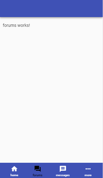
Coming along now! Next we need to add some navigation icons to our toolbars. Replace the html we added in footer-mobile.component.html with this:
<footer class="footer">
  <mat-toolbar class="footer" color="primary">
    <div fxFlex fxLayout="row" fxLayoutAlign="space-between center">

      <button mat-button routerLink="/home" routerLinkActive="active-menu-item">
        <div class="toolbar-icon">
          <mat-icon>home</mat-icon>
        </div>
        <div class="toolbar-icon-text">
          <span>home</span>
        </div>
      </button>

      <button mat-button routerLink="/forums" routerLinkActive="active-menu-item">
        <div class="toolbar-icon">
          <mat-icon>forums</mat-icon>
        </div>
        <div class="toolbar-icon-text">
          <span>forums</span>
        </div>
      </button>

      <button mat-button routerLink="/messages" routerLinkActive="active-menu-item">
        <div class="toolbar-icon">
          <mat-icon>messages</mat-icon>
        </div>
        <div class="toolbar-icon-text">
          <span>messages</span>
        </div>
      </button>

      <button mat-button (click)="onToggleSidenav()">
        <div class="toolbar-icon">
          <mat-icon>more_horiz</mat-icon>
        </div>
        <div class="toolbar-icon-text">
          <span>more</span>
        </div>
      </button>

    </div>
  </mat-toolbar>
</footer>
We are using <mat-toolbar> to create the toolbar look with Material’s primary color.
We are using flex layout to arrange the icons into a row with even spacing in between.
We are using Angular’s Material Icons with some associated text to give it a nice professional look.
Be careful not to add too many icons on a toolbar. I used four here. On some devices you may be able to fit five, but it starts to get cramped. That’s why I added the elipsis ‘more’ button which opens the sidenav and gives us more room for menu items.
Add the associated CSS to in footer-mobile.component.css.
footer {
  position: fixed;
  bottom: 0px;
  overflow: hide;
  width: 100%;
  height: 50px; // Note: iPhonePlus requires 80px, so will need to be variable, but not handling that in this demo.
}

.toolbar-icon {
  line-height: 0; // Set to zero or will affect spacing between icon and text
}

.toolbar-icon-text {
  line-height: 1.8; // Proper spacing between icon and text
  font-size: 70%; // Smaller text size for proper display under icon
}

.active-menu-item {
  color: black;
}
We use line-height to get the spacing right between the icon and text.
I chose black as the color for the active icon (i.e. the one the user clicks on).
We also need to add one method in footer-mobile.component.ts so the footer toolbar can emit an event back to app.component when the user clicks on the ‘more’ button to tell app.component to open the sidenav. Be sure to add the associated @Output decorator. You will also need to add Output and EventEmitter to the import from @angular/core.
export class FooterMobileComponent implements OnInit {
  @Output() public sidenavToggle = new EventEmitter();

  constructor() { }

  ngOnInit(): void {
  }

  onToggleSidenav = () => {
    this.sidenavToggle.emit();
  }

}
Finally, we can add the routes for our other feature components since we have icons for navigation now! The Routes array in app-routing.module should now look like this:
const routes: Routes = [
  {path: '', redirectTo: 'home', pathMatch: 'full'},
  {path: 'home', component: HomeComponent},
  {path: 'forums', component: ForumsComponent},
  {path: 'messages', component: MessagesComponent},
  {path: 'about', component: AboutComponent}
];
Let’s see how it looks! You should be able to toggle between components now!
But, one of our components is missing! Where’s the icon for the About component? Let’s add that to the sidenav menu.
Add this code to sidenav.component.html and sidenav.component.ts:
<mat-nav-list>
  <a mat-list-item (click)="onAbout()">
    <mat-icon>people</mat-icon>
    <span class="menu-text">About</span>
  </a>
</mat-nav-list>
export class SidenavComponent implements OnInit {
  @Output() sideNavClosed = new EventEmitter();

  constructor(private router: Router) { }

  ngOnInit(): void {
  }

  onAbout() {
    this.router.navigateByUrl('/about');
    this.sideNavClosed.emit(); // Emit event to parent component so it can tell sidenav to close
  }
}
When the user clicks on the About menu item, we call the onAbout() method, which routes the user to the About page and closes the sidenav menu by emitting an event to app.component. Be sure to import Output, EventEmitter and Router.
Now, you should be able to toggle the side nav by clicking on the ‘more’ button. Of course you can style the sidenav to your desired look.

We’re almost done! Let’s just add a couple of icons to the header-mobile component as well.
We will add a back arrow on the left that you can use to let the user go back to previous pages if you are embedding links within our feature components, which you probably will do. It’s always good for the user to be able to get back to the previous pages and since this could be used in a progressive web app, we don’t want to rely on the browser back button!
Replace the html in header-mobile.component.html with this:
<mat-toolbar class="mat-elevation-z4" color="primary">

  <div class="toolbar-icon">
    <mat-icon *ngIf="showBackArrow"
              alt="back arrow">
              arrow_back
    </mat-icon>
  </div>

  <span class="fill-space"></span>

  <div class="toolbar-icon">
    <mat-icon>account_circle</mat-icon>
  </div>

</mat-toolbar>
You can turn the back arrow on and off as needed using *ngIf, but we will leave it on for this demo. The ‘account’ icon could be used for a user’s profile picture.
Add the associated CSS below to header-mobile-component.css:
.toolbar-icon {
  display: inline-flex; // Proper verticle alignment
}

.fill-space {
  flex: 1 1 auto; // Fill space between two icons
}
Lastly, add the back arrow boolean to header-mobile.component.ts.
showBackArrow = true;
flex: 1 1 auto will fill the space between the arrow and account icons.
And that’s it! You now have a working header/footer/sidenav navigation for your progressive web app!
Feel free to contact me at dave@dev-reboot.com if you have any questions or comments.
Keep on developing!