
Practical, real-world animation examples with Angular
In this blog, I will who show six examples of practical, real-world animations using Angular’s animation capability, and will explain in detail how they work. Here are the animations we will cover:
- A slide-down animation exposing an Add Post component’s template
- A fade in for the new post applied
- A thumbnail photo that will expand smoothly to full-size when clicked and shrink back down when clicked again
- An animation that will draw attention to an element
- Two variations of animation when adding to a dynamic list. One will fade in. The other will slide in from the left.
- Fade animation when changing routes, configured in one place
As usual, you can find a fully working project on my GitHub.
This is a LOT to cover in one blog post, but I wanted you to have it all in one place in case you want to incorporate any of my code in your code and have a single place to reference. For brevity, I will only be going through the animations code, not the various components code. So, I recommend downloading the project from GitHub and running npm install.
Angular Version: 9.1.0
What will the animations look like?
This YouTube video shows the animations you will see when you run the project:
Project description
In the project there is an animations.ts file where all of the animation configurations are stored.
The project uses Angular Routing because we will go over how to animate a route.
There are four components:
- app.component
- post.component
- add-post.component
- other.component
app.component.html simply holds the router outlet. The default page is post.component.html, which also contains the add-post-component which we will slide in.
other.component is another component to hold some examples and another component to route to for our routing example.
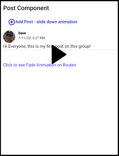
Add Post slide-in animation example
Suppose you had a forum where users can see and add posts. Perhaps you default to showing the posts, but have an ‘add post’ button which, when clicked, you want to smoothly slide in a form for adding a new post that is encapsulated in an add-post component.
Here is the animation we are using in the animations.ts file:
export const slideDownAnimation = trigger('slideDownAnimation', [
  state('in', style({
    overflow: 'hidden',
    maxHeight: '300px'
  })),
  state('out', style({
    overflow: 'hidden',
    maxHeight: '0px'
  })),
  transition('out => in', animate('800ms ease-in-out')),
  transition('in => out', animate('400ms ease-in-out'))
]);
So, what are we doing here?
The state() function allows us to collect a set of styles in an animation state, and give the state a name, such as ‘open’ and ‘closed’ or, in this case, ‘in’ and ‘out’. The state() function takes two arguments: a unique name and a style() function. You can define whatever styles you want in the object passed to the style() function. For our slide-in animation, all we want to do is expand the add-post template (we will get to this) to it’s full height when the state is ‘in’ and not show anything when the state is ‘out’. Using maxHeight with overflow hidden accomplishes this.
Note: The use of camel case for style names is required, so instead of max-height as we would use it in CSS, we use maxHeight.
The transition() function allows us to specify the animations to apply as we move from one state to another. The transition() function accepts two arguments: the first argument accepts an expression that defines the direction between two transition states, and the second argument accepts one or a series of animation steps. In our case, we move from ‘out’, where the maxHeight of add-post is zero and thus not shown, to ‘in’, where the maxHeight is 300px, and so the element is visible. In other examples, we will see other types of transitions and the use of a wildcard.
The animate() function is where the magic happens. Use the animate() function to define the length, delay, and easing of a transition, and to designate the style function for defining styles while transitions are taking place. The animate() function accepts the timings and styles input parameters. In our example, because our styles are defined in the state() function, we only need to define the timings.
The timings parameter takes a string defined in three parts: animate (‘duration delay easing’).
In our example, we do not use delay. We want the slide-in (transition from ‘out’ to ‘in’) to occur over 800 milliseconds. We could have expressed this as .8s or just 800 as well. The third argument, easing, controls how the animation accelerates and decelerates during its runtime. For example, ease-in causes the animation to begin slowly, and to pick up speed as it progresses. You can find some good advice on easing in Material Design documentation.
Valid values for easing are ease, ease-in, ease-out, ease-in-out, or a cubic-bezier() function call. Here is a nice blog by Chris Coyier on these easing options. The one we are using, ease-in-out, is slow at the beginning and the end and faster in the middle.
For slide-out, perhaps we want our transition to happen faster, so we go with a duration of 400 milliseconds.
Finally, you will see all of this is wrapped up in the trigger() function. An animation requires a trigger, so that it knows when to start. The trigger() function collects the states and transitions, and gives the animation a name, so that you can attach it to the triggering element in the HTML template.
So, how do we use this animation?
In post.component.ts we import slideDownAnimation from animations.ts and add it to the animations array in the @Component decorator. You could also simply define your animation directly in the animations array of the component, but in our case we define all of our animations in one file and export them so they may be imported into various components.
import { slideDownAnimation, addItemFadeAnimation } from './../animations';

@Component({
  selector: 'app-post',
  templateUrl: './post.component.html',
  styleUrls: ['./post.component.css'],
  animations: [
    slideDownAnimation,
    addItemFadeAnimation
  ]
})
In post.component.html we tie a container element for the HTML we wish to animate to the trigger name prefixed with ‘@’ and wrapped in square brackets.
  <div [@slideDownAnimation]="addPostOpen">
    <app-add-post (post)="postAddComplete($event)">
    </app-add-post>
  </div>
Then, we bind the trigger to a template expression using standard Angular property binding syntax. In our example we tie it to a property called addPostOpen which is defined in post.component.ts as follows:
addPostOpen = 'out';
And so, you can see that the default is our ‘out’ state where you might remember maxHeight is zero, and so it is hidden. All we have to do to activate our animation to show the add-post template, is set the addPostOpen property to ‘in’! We simply create a button a user can click to add a post and then set the addPostOpen property to ‘in’, which animates the showing of my app-add-post component’s template.
Fade in animation on new post
When we add a post, it is added to our posts array and is displayed for the user. We will use animation to slowly fade in the new post.
Here is the animation in the animations.ts file:
export const addItemFadeAnimation = trigger('addItemFadeAnimation', [
  transition('* <=> *', [
    query(':enter',
      [style({ opacity: 0 }), animate('3000ms ease-out', style({ opacity: 1 }))],
      { optional: true }
    ),
    query(':leave',
      animate('3000ms', style({ opacity: 0 })),
      { optional: true }
    )
  ])
]);
Here we start again with a trigger, named ‘addItemFadeAnimation’. But in this example we start with transition. Remember, the transition() function accepts two arguments: the first argument accepts an expression that defines the direction between two transition states, and the second argument accepts one or a series of animation steps.
In this example, when we change our triggered value in any way, we want the animation to trigger. We define this using wildcard *. If the value changes from anything to anything, apply the animation.
Let’s look at how we apply this trigger first. In post.component.html we wrap an *ngFor directive with our animation trigger. If the posts array length changes (i.e. we add a new element to the array), then apply the animation to the new element.
<div [@addItemFadeAnimation]="posts.length">
  <div *ngFor="let post of posts">
    <div class="author" >
      <div>
        <img class="image profile-image-post"
              [src]="profileImageUrl"
              style="width:40px;height:40px;">
      </div>
      <div class="name-and-date">
        <div class="display-name">
          Dave
        </div>
        <div>

        </div>
      </div>
    </div>
    <div class="body">
      <div>
        <span class="body-text"></span>
      </div>
    </div>
    <mat-divider></mat-divider>
  </div>
</div>
Back to the animation. We are using the query() function, which is typically used to find an element in the HTML. The query() function takes three arguments: (selector, animation, options). The selector identifies the element to query, or a set of elements that contain Angular-specific characteristics.
In our case we are setting the selector to the alias :enter which really means going from a state of void to anything (void => *) and :leave which is an alias for * => void. We are not deleting posts in this example, so :leave will not be used, but I wanted to leave it for you to see what you could do. For more information on ‘Angular-specific characteristics’ see the Angular documentation.
query(':enter',
  [style({ opacity: 0 }), animate('3000ms ease-out', style({ opacity: 1 }))],
  { optional: true }
),
Next we apply the style using the style() function, animating from an opacity of zero (invisible) to one over 3 seconds.
By default, Angular throws an error when zero items are found. We set the optional flag to ignore this error.
Thumbnail photo expansion animation example
Suppose you are showing a thumbnail photo to a user that you want to exand to full size when the user clicks on the image. It would be nice if the image expanded and contracted slowly rather than jumping to full size. Let’s see how we do that.
Here is the animation we are using in the animations.ts file:
export const thumbnailImageExpandAnimation = trigger('thumbnailImageExpandAnimation', [
  state('thumbnail', style({width: '80px'})),
  state('fullsize', style({ width: '100%'})),
  transition('thumbnail => fullsize', animate(1000, style({ width: '100%'}))),
  transition('fullsize => thumbnail', animate(1000, style({ width: '80px'})))
]);
This animation is simliar to our slide-in example above. We define the start state we call ‘thumbnail’ and the end state we call ‘fullsize’. Then we animate expansion to full size over 1 second and contraction back to original size in 1 second.
See the slide-in example for an explanation of the trigger(), state(), transition(), animate() and style() functions.
We use the animation in other.component.html as follows:
<p>Click thumbnail to view full size</p>
<div>
  <img [@thumbnailImageExpandAnimation]="imageState"
  class="image"
  src="./../../assets/images/redwoods.png"
  (click)="expandImage()">
</div>
Here we use the property imageState whose value is defaulted to ‘thumbnail’ and changed to ‘fullsize’ in the expandImage() function when the user clicks on the image. This triggers our thumbnail => fullsize transition. Setting it back to ‘thumbnail’ when the user clicks on the full size image will trigger our fullsize => thumbnail animation.
expandImage() {
  if (this.imageState === 'thumbnail') {
    this.imageState = 'fullsize';
  } else {
    this.imageState = 'thumbnail';
  }
}
Draw attention to an element animation example
Perhaps you wish to draw the user’s attention to an element on the page when some event happens.
Here is the animation we are using in the animations.ts file:
export const attentionAnimation = trigger('attentionAnimation', [
  transition('* => drawAttention', [
    query('.attention', animate(1000, style({color: 'red', fontSize: '24px', fontWeight: 'bold'}))),
    query('.attention', animate(1000, style({color: 'black', fontSize: '16px', fontWeight: 'normal'})))
  ])
]);
I hope things are starting to look familiar now. Similar to the post fade in animation above, we start with a transition and use two query() functions. In this case, we want to begin our animation when the trigger is set to ‘drawAnimation’.
This time we are using the query() function to find a specific element with a class name of attention. First, over 1 second we will grow the text we want to draw attention to and change it’s color to red and bold it. Then the second query() funciton, brings the text back to normal.
In other.component.html we apply this animation:
<div>
  <button mat-button class="mat-raised-button" (click)="startAnimation()">Draw attention animation</button>
</div>

...

<div [@attentionAnimation]="attention">
  <p class="attention">some text</p>
</div>
We initiate the animation with a button. In the startAnimation() function, we change the value of the attention property to ‘drawAttention’, which triggers the animation on an element futher down the page, which we identified with a class name of attention.
When the user clicks the button, ‘some text’ will grow to 24px, become bold and red and then shrink back to normal.
Add-to-list animation example
Suppose you have a dynamic list of items and you allow the user to add an item to the list. You can animate the addition of the item to the list. I will show two ways: fade in (as we did above for a new post) and slide in from the left.
Here is the animation we are using in the animations.ts file:
export const listAddItemFadeAnimation = trigger('listAddItemFadeAnimation', [
  transition('* <=> *', [
    query(':enter',
      [style({ opacity: 0 }), animate('800ms ease-out', style({ opacity: 1 }))],
      { optional: true }
    ),
    query(':leave',
      animate('800ms', style({ opacity: 0 })),
      { optional: true }
    )
  ])
]);

export const listAddItemSlideInAnimation = trigger('listAddItemSlideInAnimation', [
  state('slideIn', style({ transform: 'translateX(0)' })),
  transition(':enter', [
    style({ transform: 'translateX(-100%)' }),
    animate('0.3s ease-in')
  ]),
  transition(':leave', [
    animate('0.3s ease-out', style({ transform: 'translateX(100%)' }))
  ])
]);
ListAddItemFadeAnimation works just like the post add above. Any change of our trigger item (i.e. length of the array) will cause the new item to fade in by changing it’s opacacity over 800 milliseconds.
For slide-in, we are using something new called transform. transform is used to move the element in and out of position. The translateX() function defines the position. In our final state, we want the normal position which is defined as translateX(0). In the transition() function we ease in from the left (i.e. translateX(-100%)) over 300 milliseconds. In the example, I do not have a delete, but if I did, the :leave transition would throw the item off to the right (i.e. translateX(100%)).
Here is how we use this animation in other.component.html:
  <div>
    <button mat-button
            class="mat-raised-button"
            (click)="addItemToList()">
        Add to list animations
  </button>
  </div>

  <p>Fade in animation</p>
  <ul [@listAddItemFadeAnimation]="items.length" class="items">
    <li *ngFor="let item of items" class="item">
      Item
    </li>
  </ul>
  <mat-divider></mat-divider>
  <p>Slide in animation</p>
  <ul class="items">
    <li *ngFor="let item of items" class="item" [@listAddItemSlideInAnimation]="'slideIn'">
      Item
    </li>
  </ul>
  <mat-divider></mat-divider>
When the user clicks a button, we add an item to the Items array. We simply set the value of our listAddItemSlideInAnimation trigger to ‘slideIn’ which triggers our slide-in animation.
Route animation
As the user switches from one screen to the next through Angular’s routing, it would be nice if the change was smooth rather than jarring. Perhaps the old page fades out and the new page fades in.
Here is the animation we are using in the animations.ts file:
export const fadeAnimation = trigger('fadeAnimation', [
  transition('* => *', [
    query(
      ':enter',
      [style({ opacity: 0 })],
      { optional: true }
    ),
    query(
      ':leave',
      [style({ opacity: 1 }), animate('0.6s', style({ opacity: 0 }))],
      { optional: true }
    ),
    query(
      ':enter',
      [style({ opacity: 0 }), animate('0.6s', style({ opacity: 1 }))],
      { optional: true }
    )
  ])
]);
We are using the same techniques we used in the above animations. When our trigger changes value, we want to do three sequential animations using the query() function.
In the first query(), we hide the new page as it enters so we can fade out the old page. :enter (i.e. void => *) identifies the new page.
In the second query(), we animate the old page from full opacity to invisible over 600 milliseconds. :leave (i.e. * => void) identifies the page we are leaving.
In the third query(), we animate the new page from invisible (as we set in the first query) to fully visible over 600 milliseconds.
That should all look familiar. But how do we apply this to our routes? We apply it to our main router-outlet in app.component.html:
<main [@fadeAnimation]="o.isActivated ? o.activatedRoute : ''">
    <router-outlet #o="outlet"></router-outlet>
 </main>
Here we trigger our route fade animation when a route is activated. We can determine this by assigning ‘outlet’ to a reference variable we called ‘#o’ and checking the isActivated state of ‘o’, our outlet. If it is activated, then set our trigger to the activatedRoute, otherwise set it to null.
Since we applied this to the main router-outlet, it will work for all route transitions!
Conclusion
In this blog, we have used many of the available animation functions:
- trigger(): Kicks off the animation and serves as a container for all other animation function calls. HTML template binds to triggerName. Use the first argument to declare a unique trigger name. Uses array syntax.
- transition(): Defines the animation sequence between two named states. Uses array syntax.
- style(): Defines one or more CSS styles to use in animations. Controls the visual appearance of HTML elements during animations. Uses object syntax.
- query(): Specifies a group of animation steps (inner animations) to be run in parallel. Animation continues only after all inner animation steps have completed. Used within sequence() or transition().
- state(): Creates a named set of CSS styles that should be applied on successful transition to a given state. The state can then be referenced by name within other animation functions.
- animate(): Specifies the timing information for a transition. Optional values for delay and easing. Can contain style() calls within.
There are a lot more you can use to create more complex animations including:
- keyframes(): Allows a sequential change between styles within a specified time interval. Use within animate(). Can include multiple style() calls within each keyframe(). Uses array syntax.
- group(): Specifies a group of animation steps (inner animations) to be run in parallel. Animation continues only after all inner animation steps have completed. Used within sequence() or transition().
- sequence(): Specifies a list of animation steps that are run sequentially, one by one.
- stagger(): Staggers the starting time for animations for multiple elements.
- animation(): Produces a reusable animation that can be invoked from elsewhere. Used together with useAnimation().
- useAnimation(): Activates a reusable animation. Used with animation().
- animateChild(): Allows animations on child components to be run within the same timeframe as the parent.
Hopefully, by using real-world, practical examples, you can get an idea of how powerful and beautiful Angular animations can be and how you might apply it in your own project!
As a reminder, you can find a fully working project on my GitHub.
Feel free to contact me at dave@dev-reboot.com if you have any questions or comments.
Keep on developing!